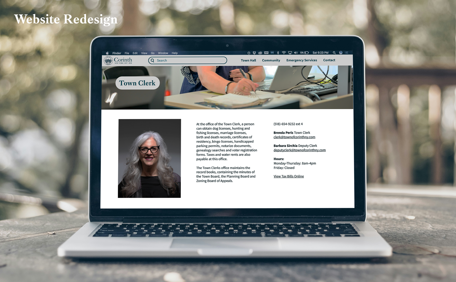
Problem
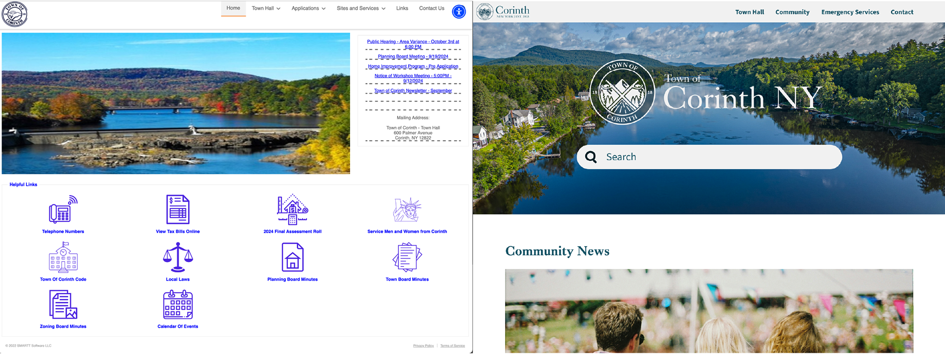
The current Town of Corinth website appears low in quality. Its harsh blue text is unwelcoming and its icons are inconstant. The site’s information repeats, leads outside of the site, and is disorganized. The Town of Corinth brand looks does not reflect or uplift the town’s values.
Solution
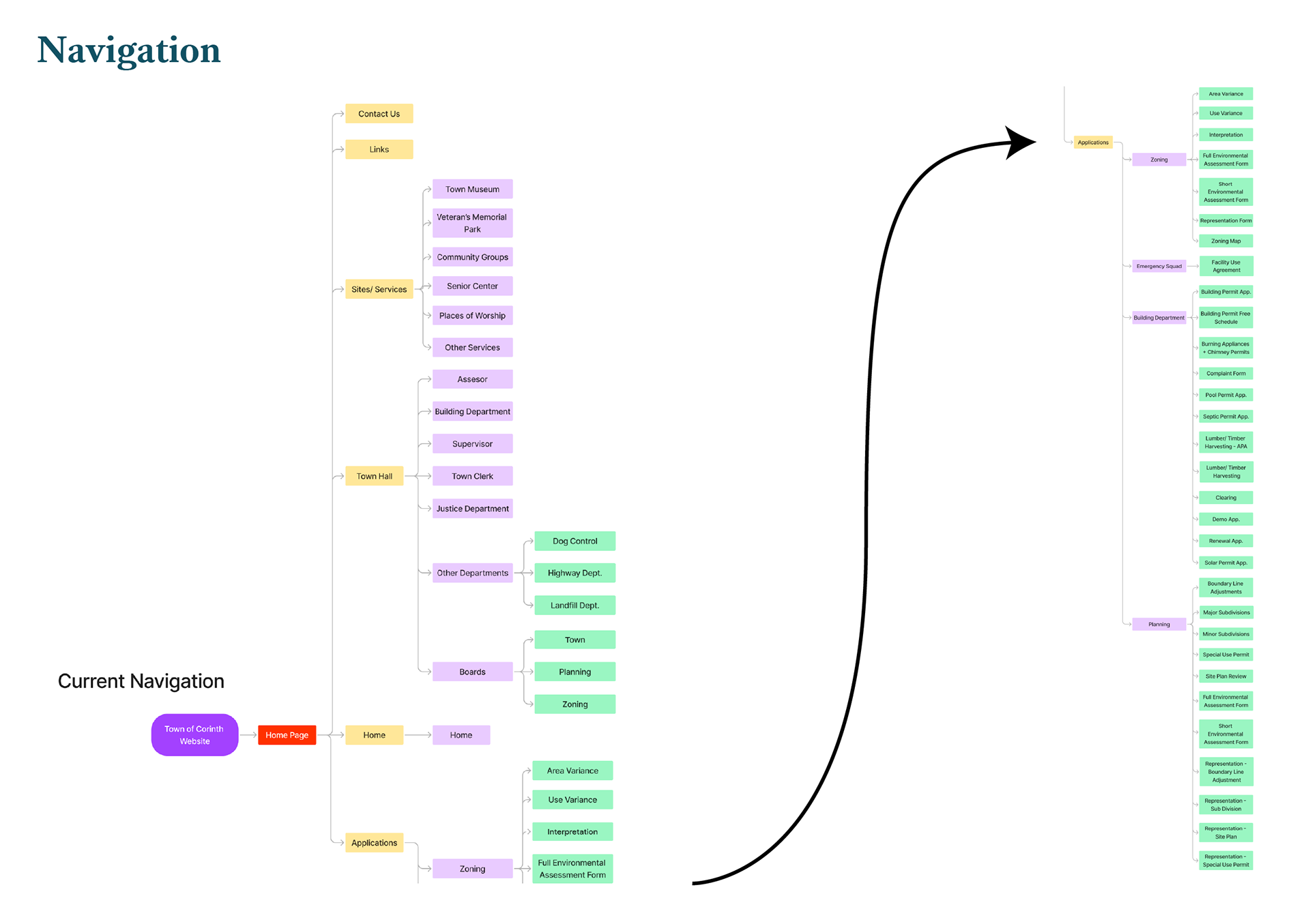
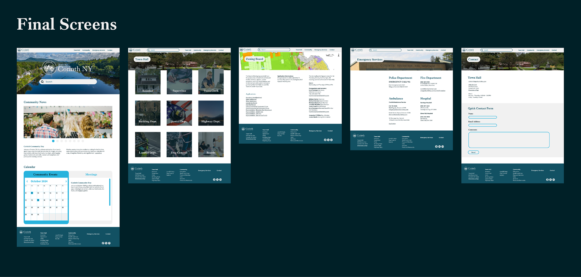
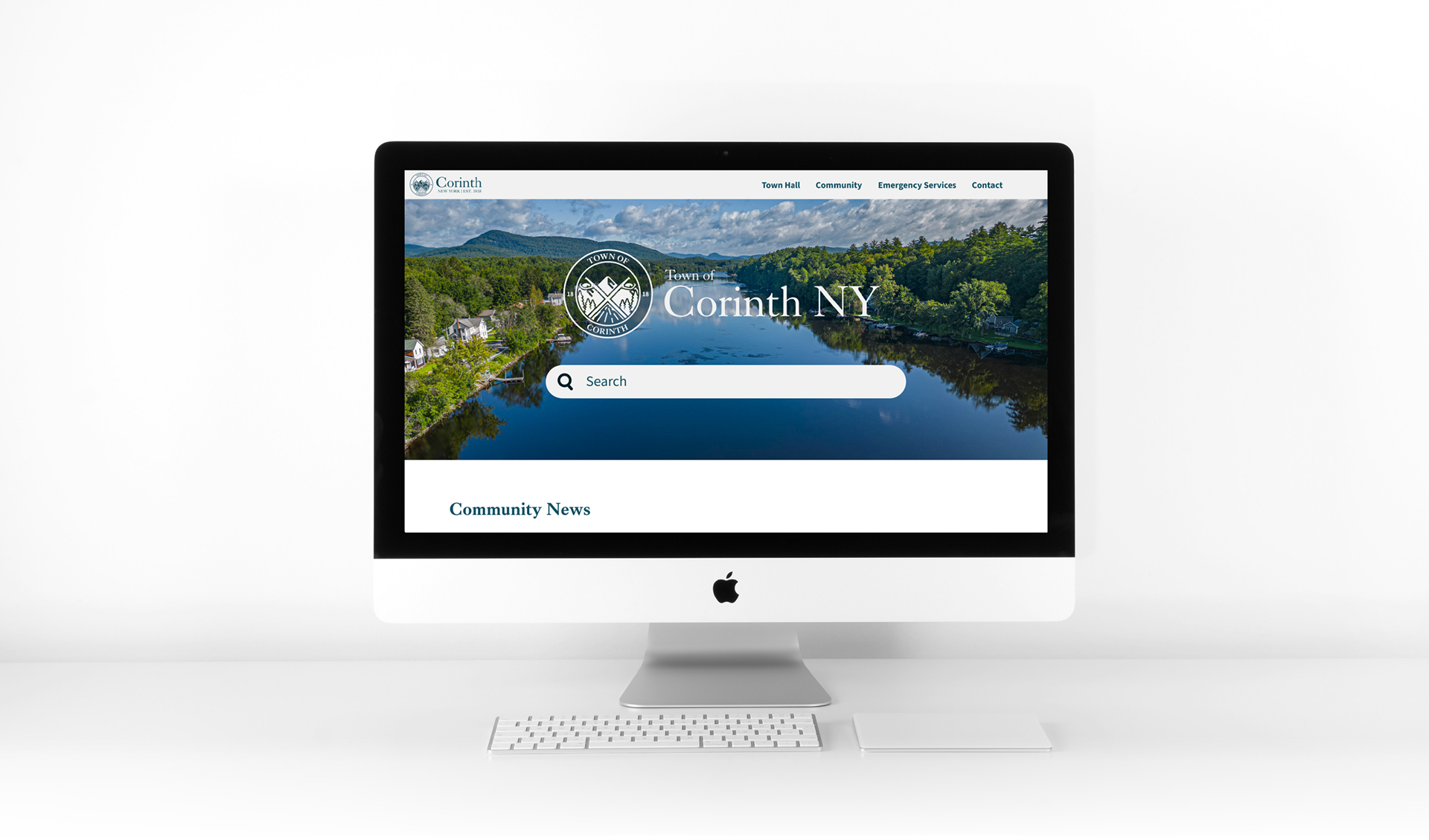
The website needs to have a more cohesive and community based feeling. The site’s UX needs to have fewer clicks and its information should be oriented towards young parents and the elderly population. The Town of Corinth brand should reflect the town’s history and appear professional as well as welcoming.
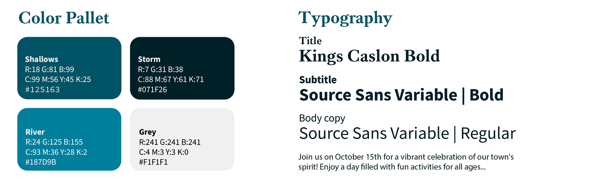
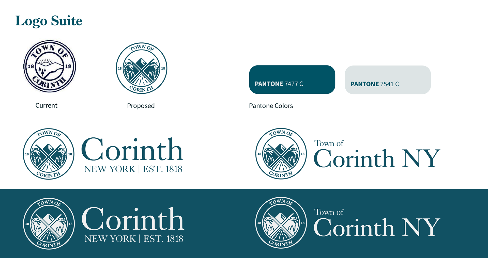
Updated Branding
Goal
The current Town of Corinth’s Branding system should be visually distinct from the Corinth School Districts website through color and typography. It should feel welcoming and professional to visitors and to new residents.
The Branding and mark will reflect the town’s slogan and geographical positioning, “The Gateway to the Adirondacks,” Its place along the Hudson river and its rich history in logging and the paper industry.
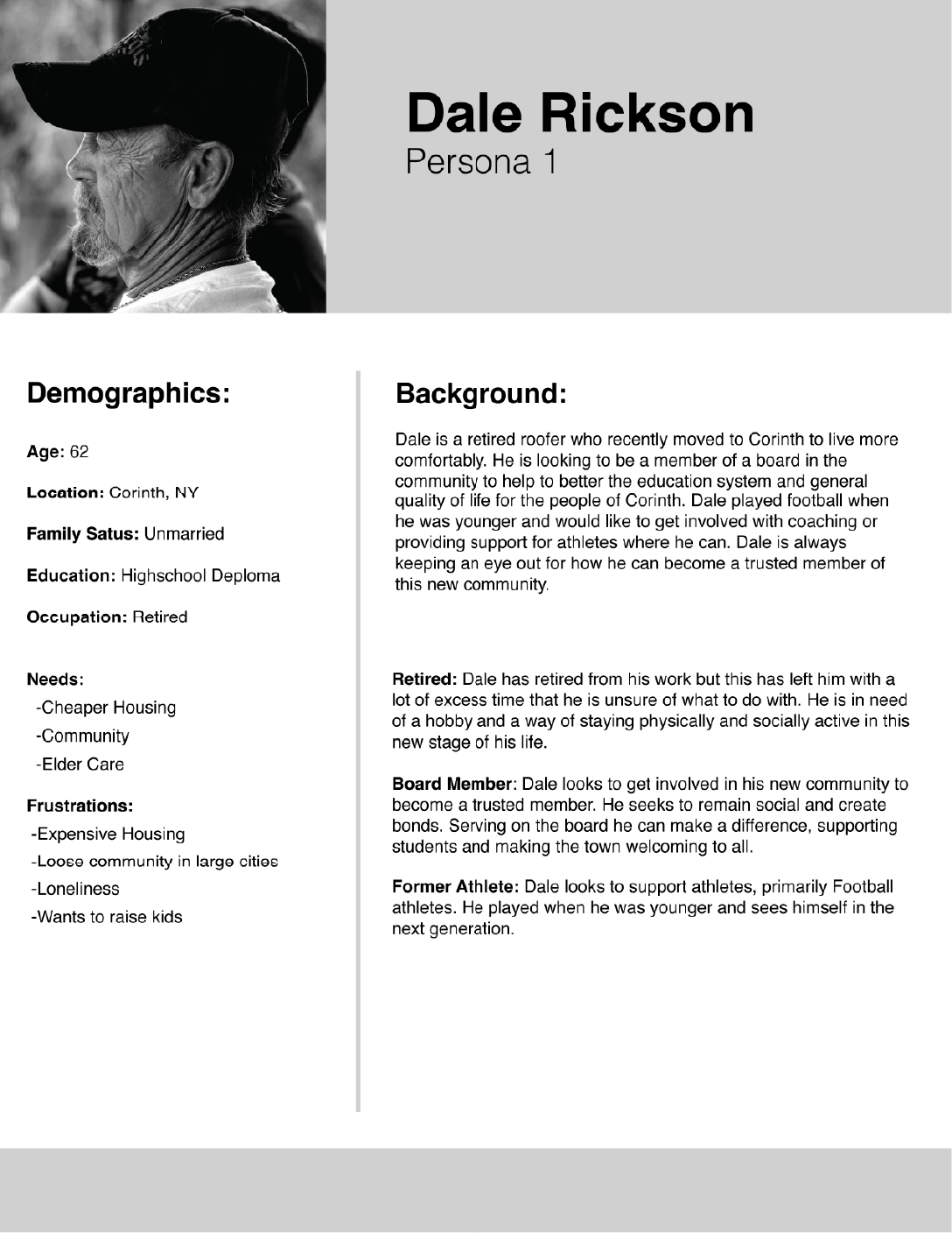
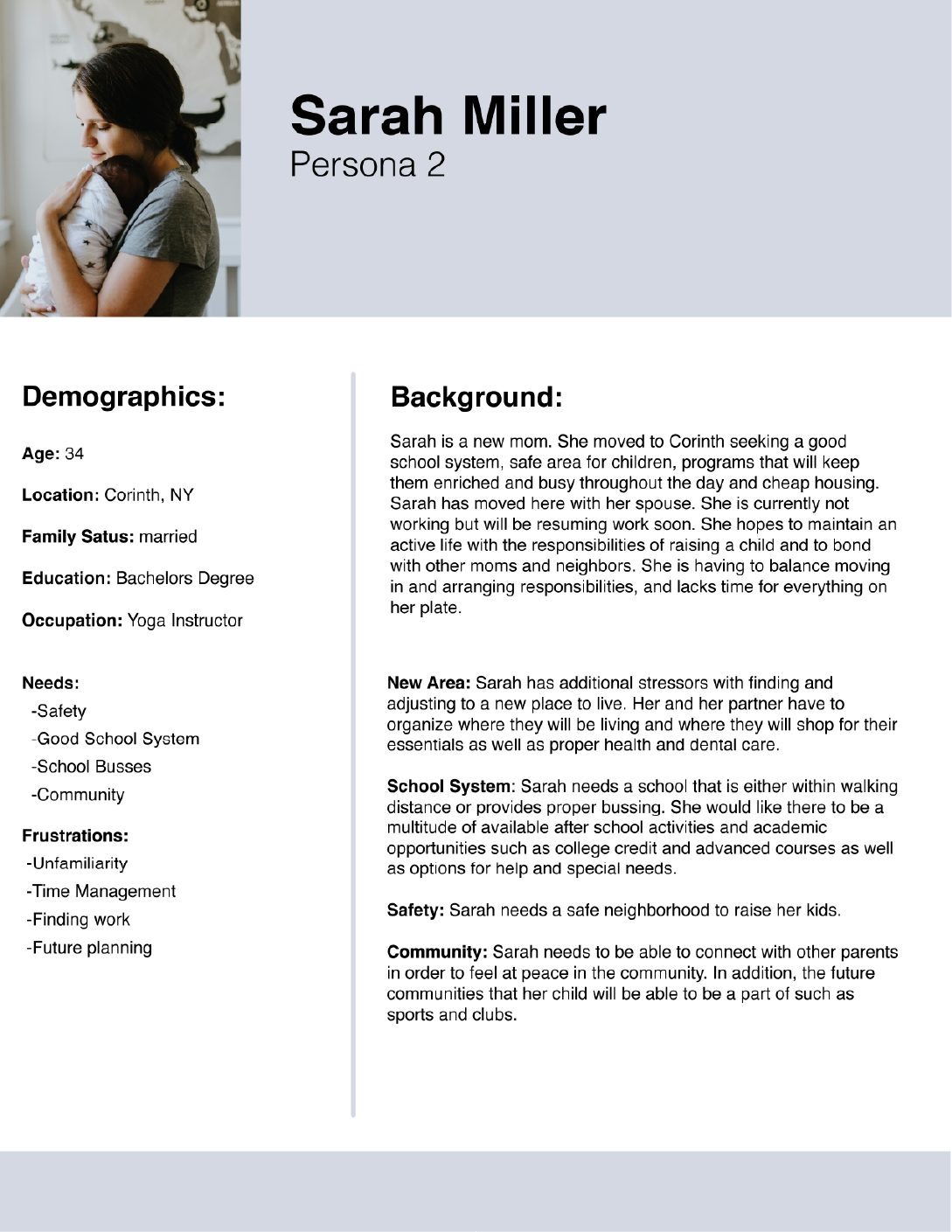
Personas
Those who migrate to the Town of Corinth tend to be looking for a cheaper cost of living that is simultaneously found in a safe area. They tend to be young families or retirees. Below is an example of each demographic.
Competitive Analysis
These are the websites of a city and a town within an hour radius of Corinth, New York. I analyzed their websites in order to determine what I should avoid and what elements are good to have in this type of website.
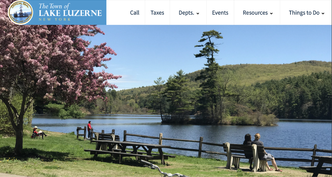
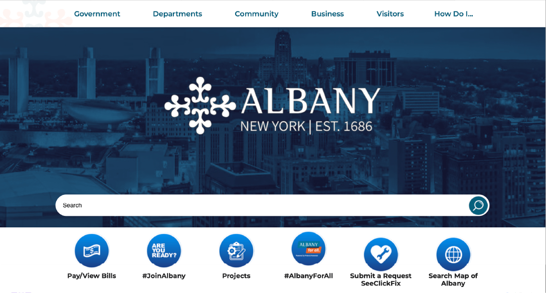
• Successful Hero Image
• Serif and San Serif Typefaces
• Upcoming Events Section
• Last Updated Notification
• Calendar
• Logo as “Home Button”
• Variable Search Bar
• “How do I...” Page