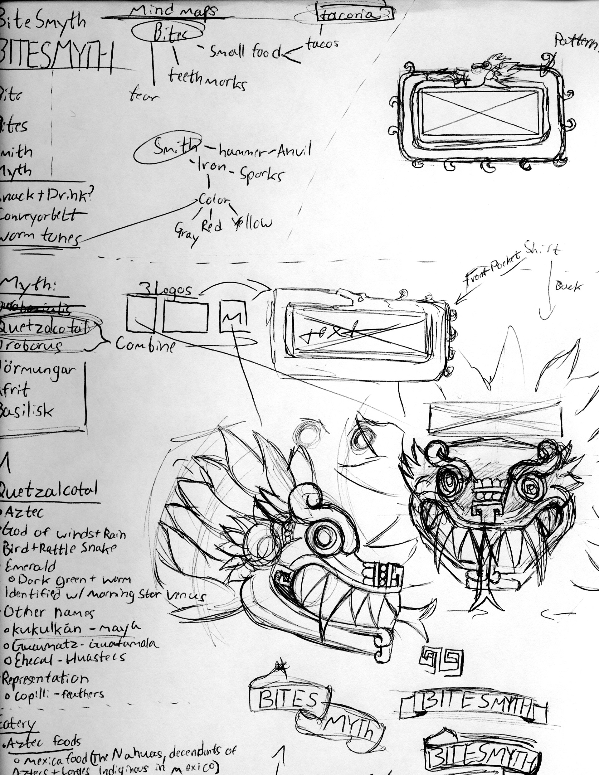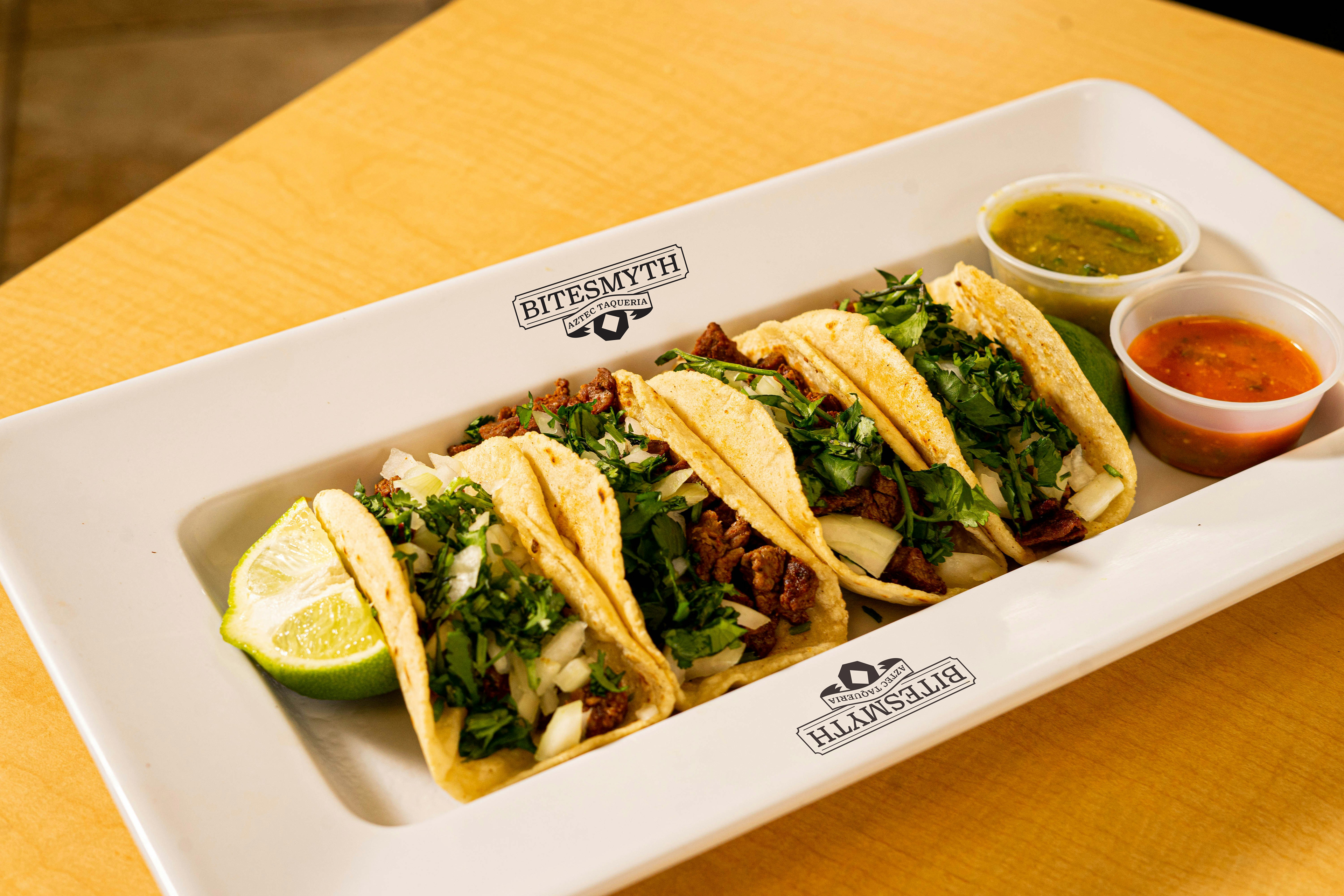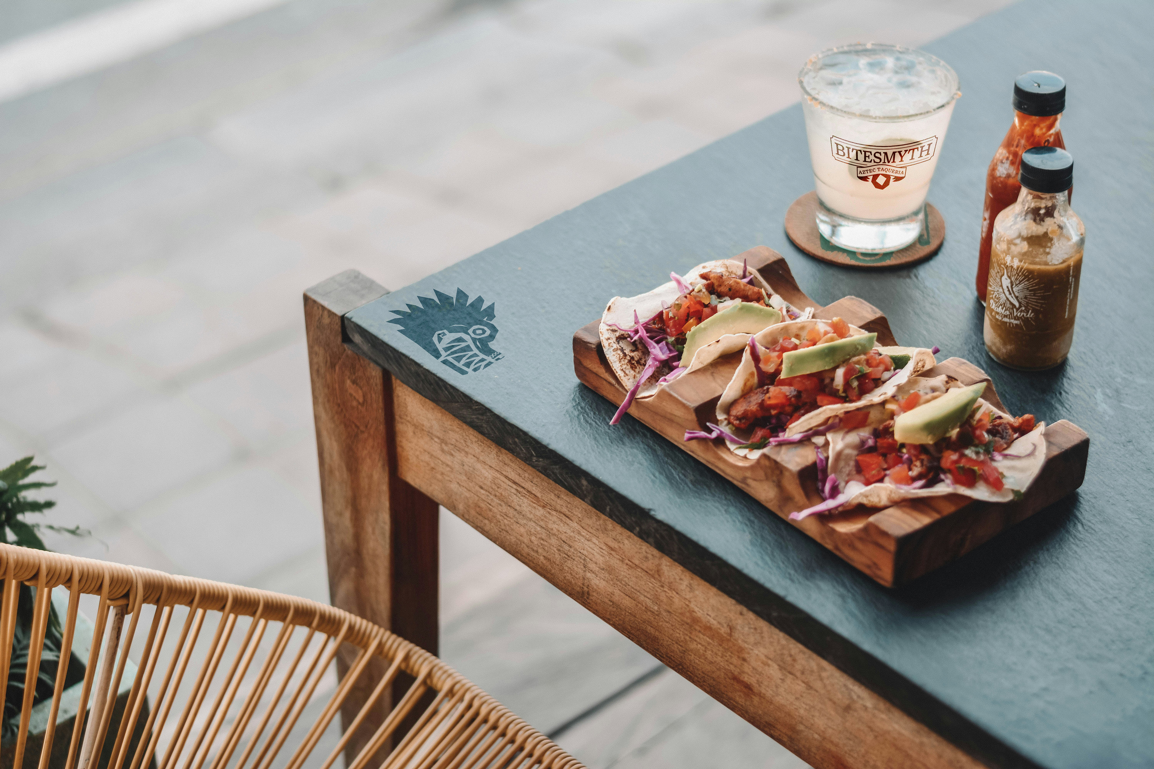
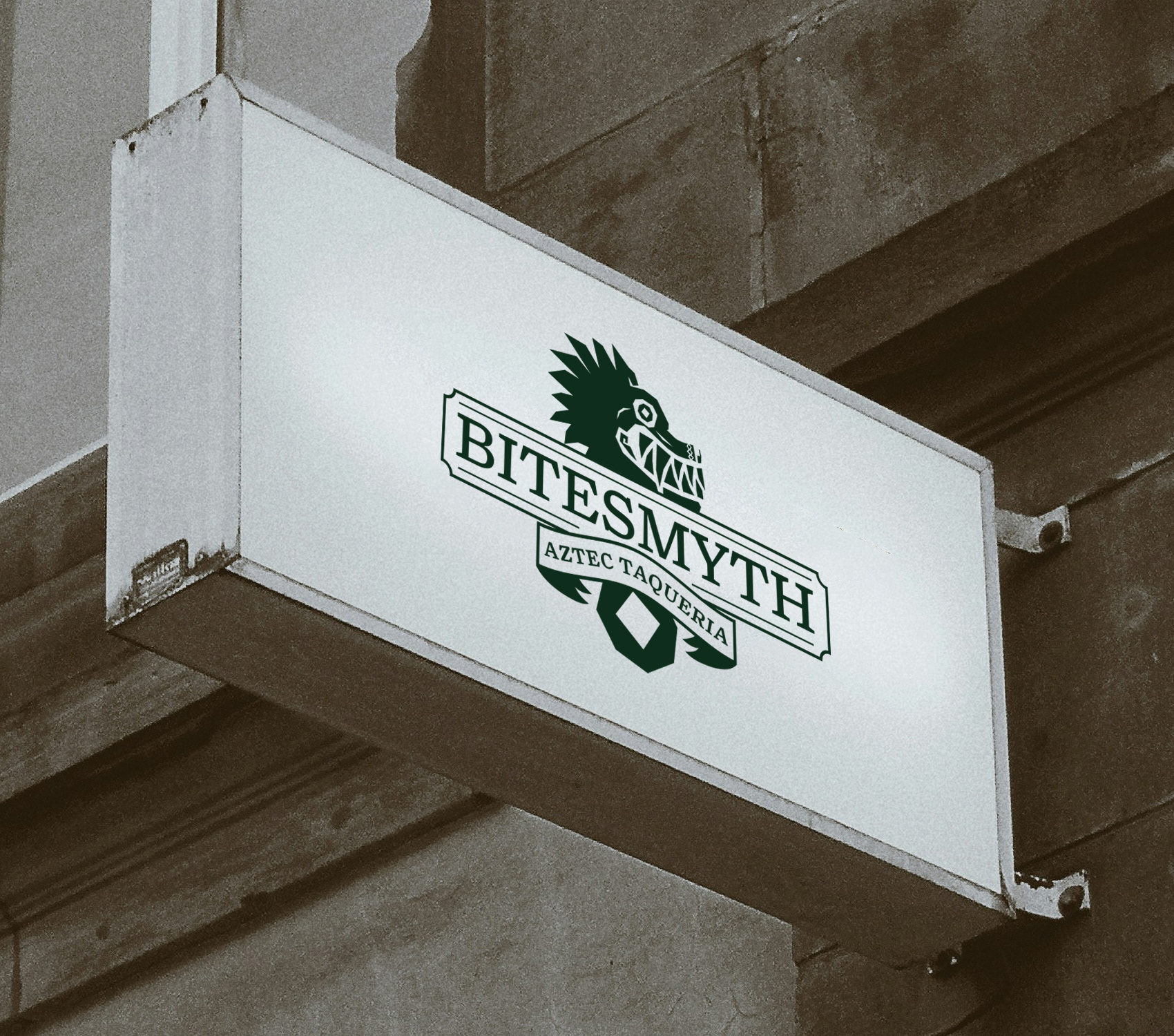
BiteSmyth is a taqueria. It is a middle-priced restraunt that focuses on authenticity in their foods. They believe in providing a cultural experience that has not been “Americanized.“ I chose this food because the largest population of indigenous Aztec people, called the Nahuas, are in what is now Mexico.
Target Audience
Men and women in their early 20s to late 30s of average financial standing.
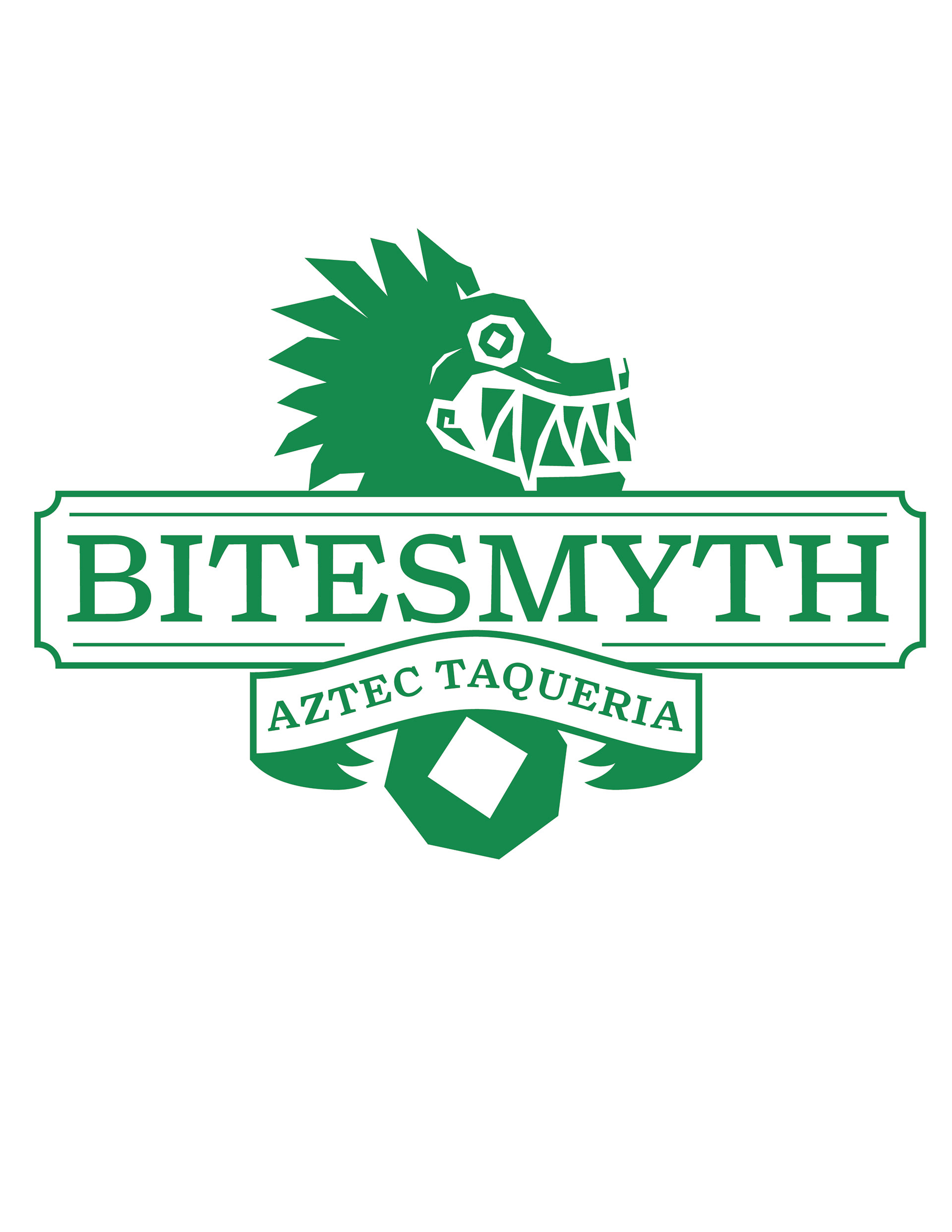
The icon is a character from Aztec Myth, Quetzalcoatl. He was a creator god who was responsible for the wind and the rain. He was often depicted with jade colored feathers, a mix of serpent and bird-like features.
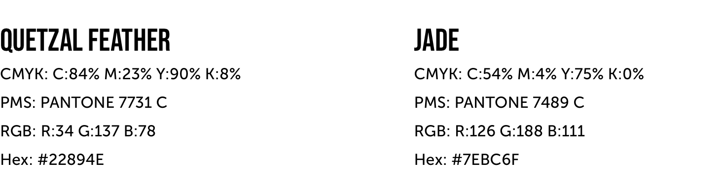
The green color and feathers comes from the Quetzal bird with its green and red feathers. Quetzalcoatl has been connected with jade. The red color is named Carmine after a red dye that was made from the Cochineal bug and used in Mayan and Aztec rituals as representations of the sun, blood and depictions of gods.
Primary Logo: Color
Logotype

Symbol

Digital Icon
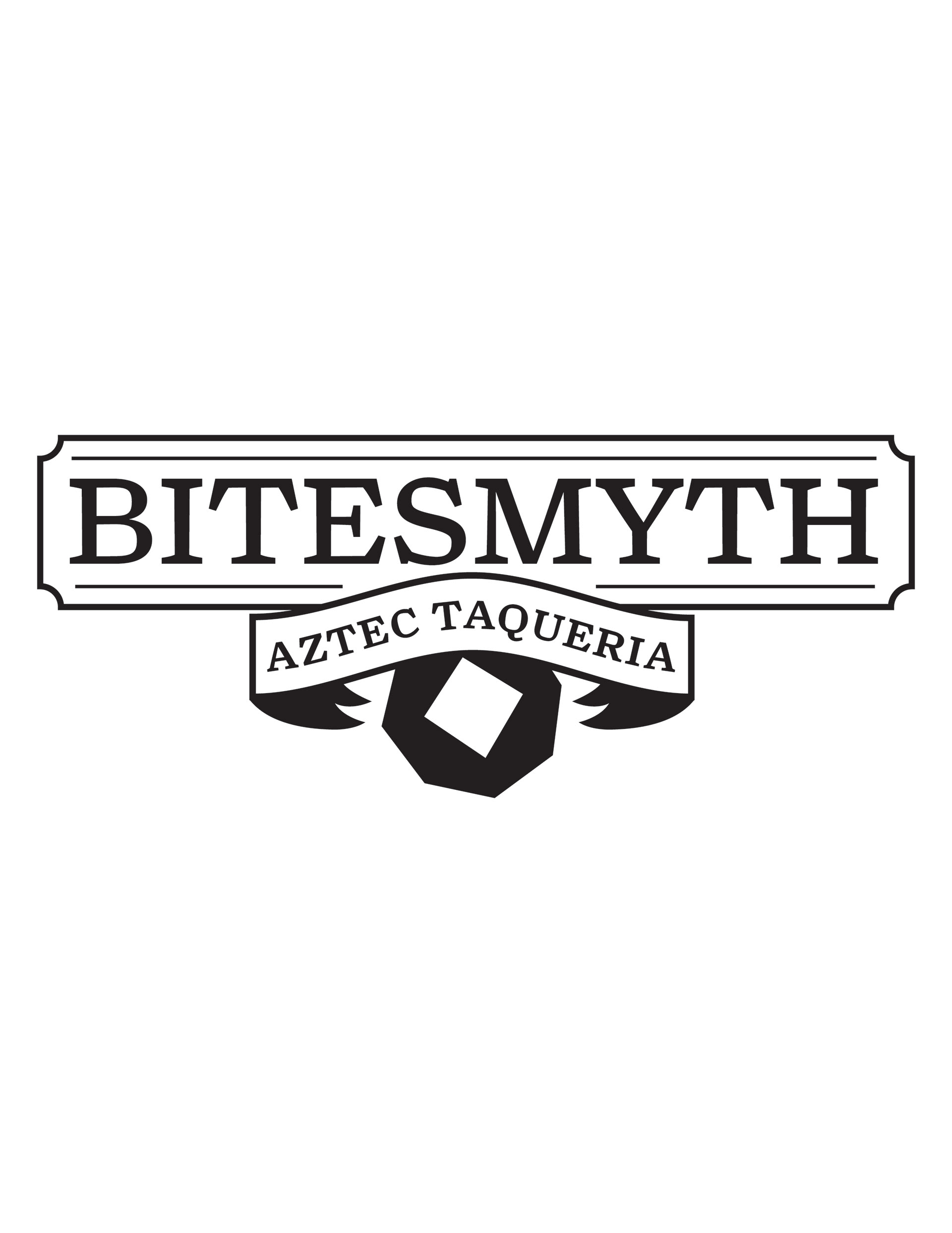
My typography holds the same sharp angles and subtle curves as the illustrative aspects do. The typeface is Turnip by David Jonathan Ross. It is framed in banners to give it a more elegant and sophisticated look.
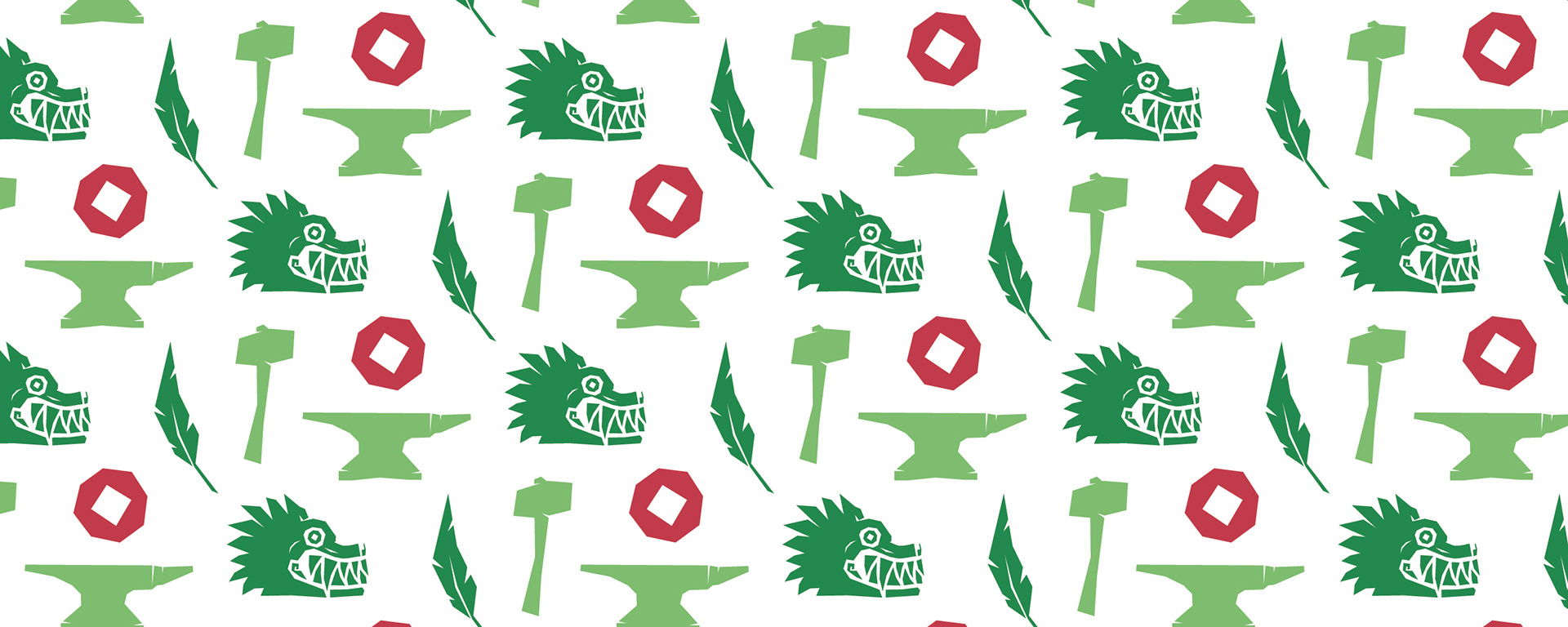
A pattern was created from decorative elements and marks such as the symbol and digital icons. The decorative elements consist of some items that are characteristic of the wordplay of “Smyth” reading as “Smith.” These items include a hammer, anvil and a feather of the Quetzal bird.

Anvil

Hammer

Quetzal Feather

Quetzalcoatl

Carmine
CMYK: C:18% M:92% Y:68% K:6%
PMS: PANTONE 199 C
RGB: R:193 G:57 B:75
Hex: #C1394B