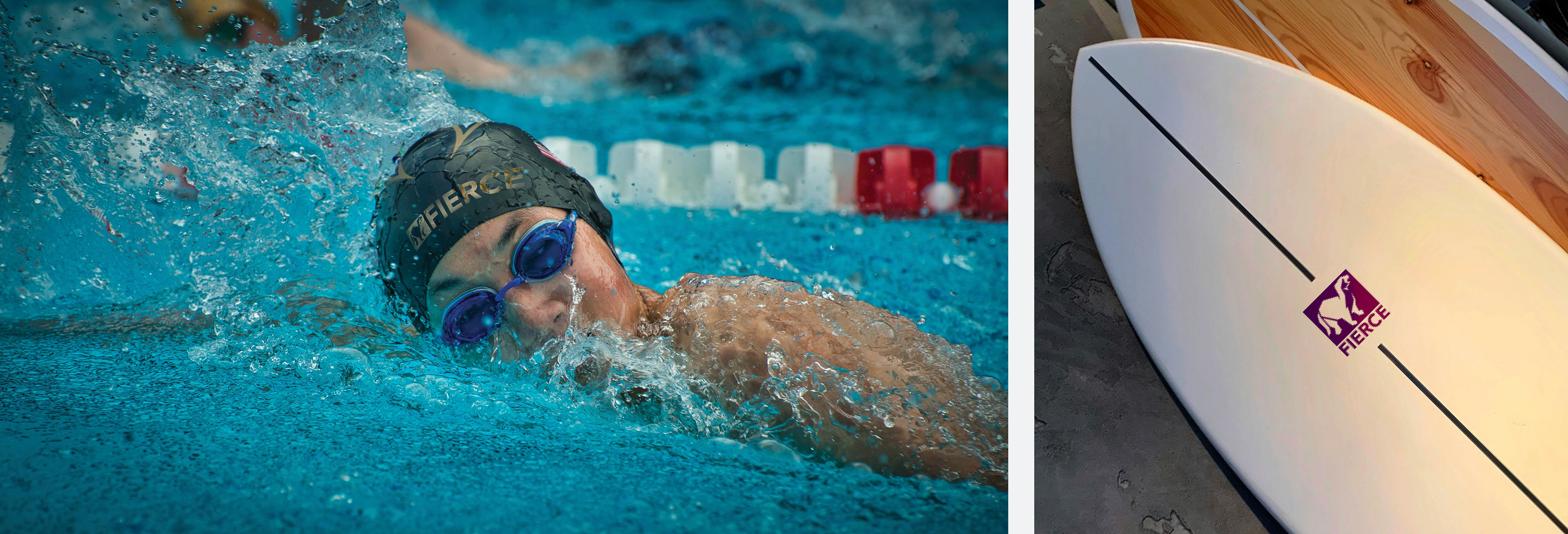
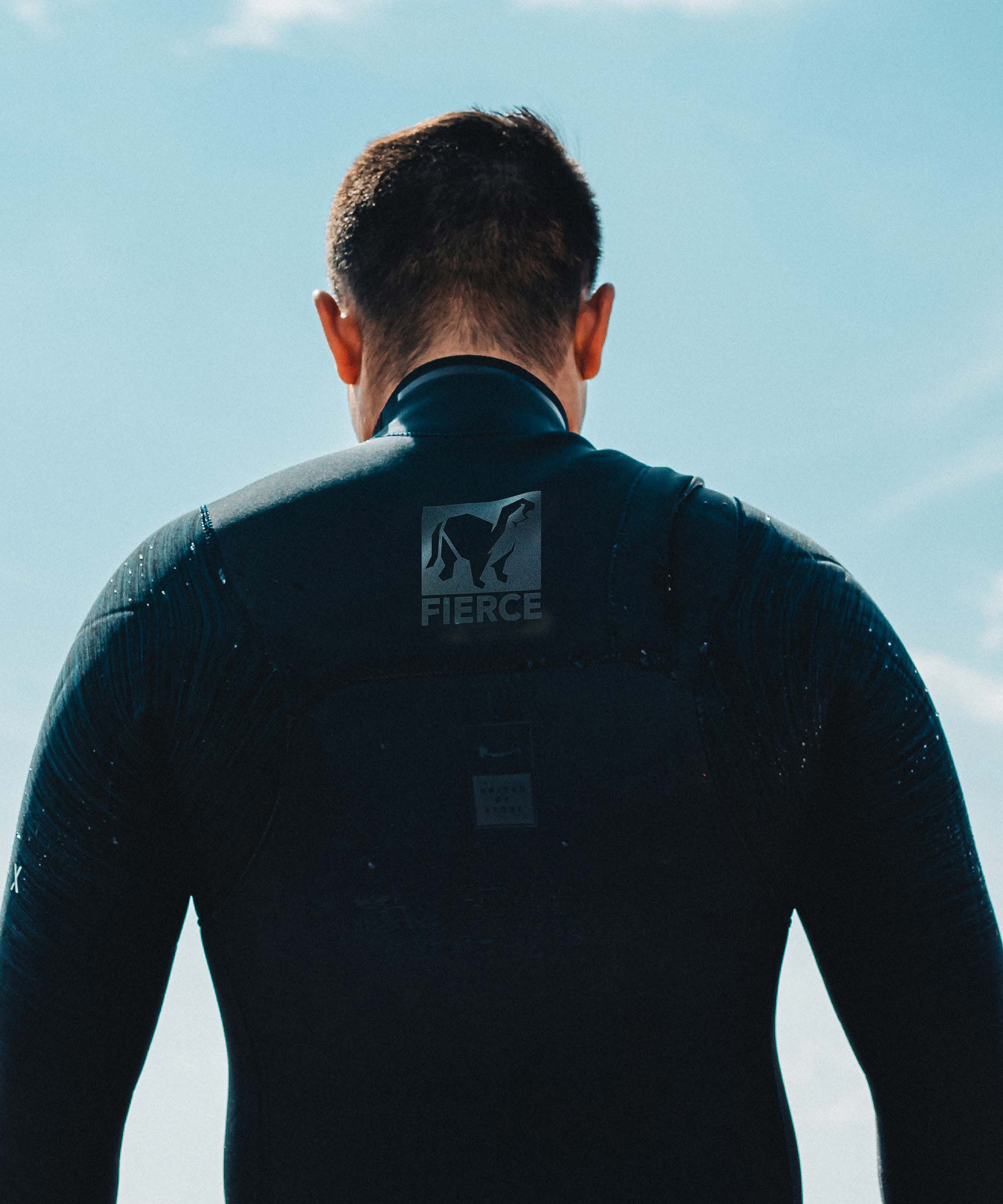
Fierce is a new age water sports and sports apparel company. They sponsor events in the worlds of competitive swimming, diving, surfboarding and more. Fierce creates the equipment that powers the next generation of world class athletes.
Target Audience
Adventurous Men and Women in their early to late 20s of above average financial standing who live in warmer climates and costal areas. This audience is less likely to be married and are yet to be home owners.
The secondary audience is adults in their early to late 50s who have children in their late teens or early 20s. These parents would be funding their children's hobby.
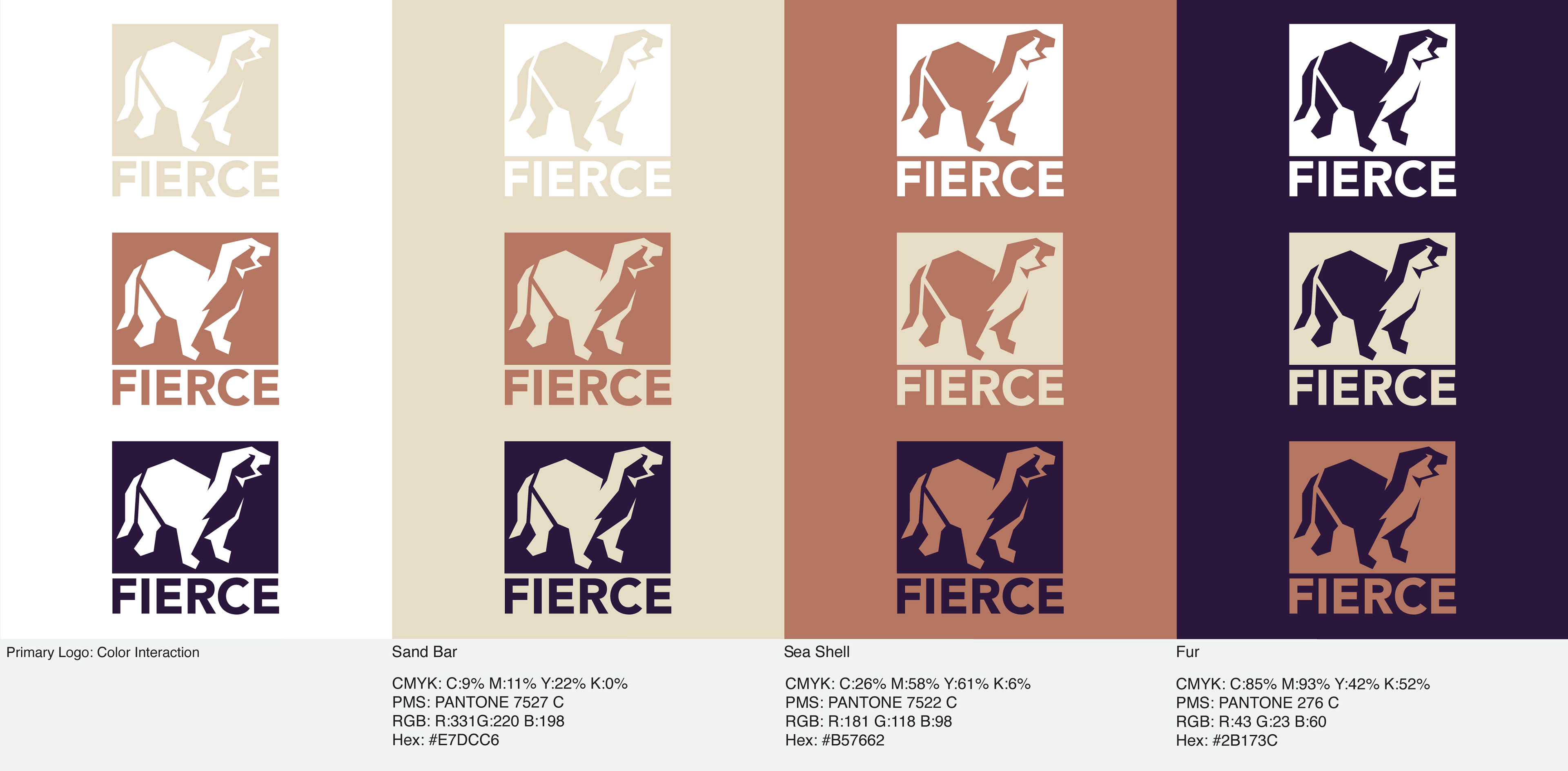
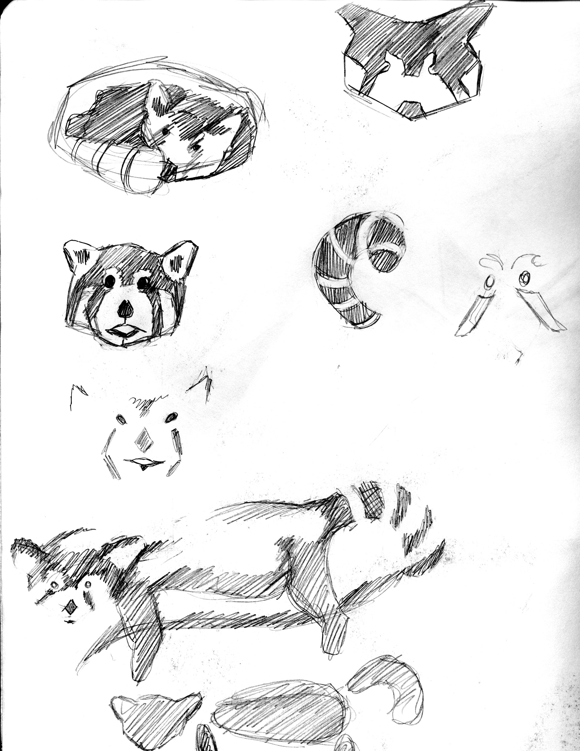
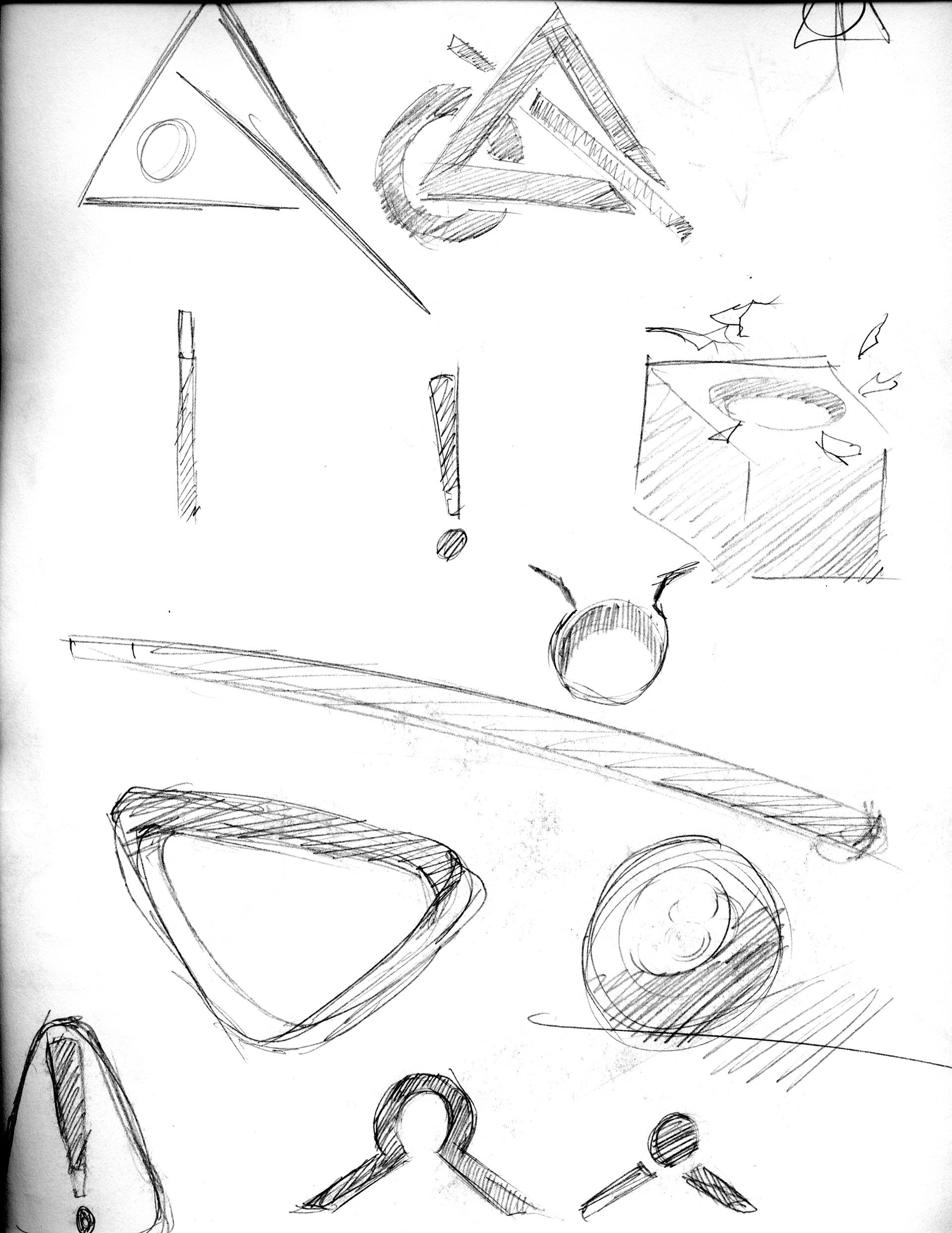
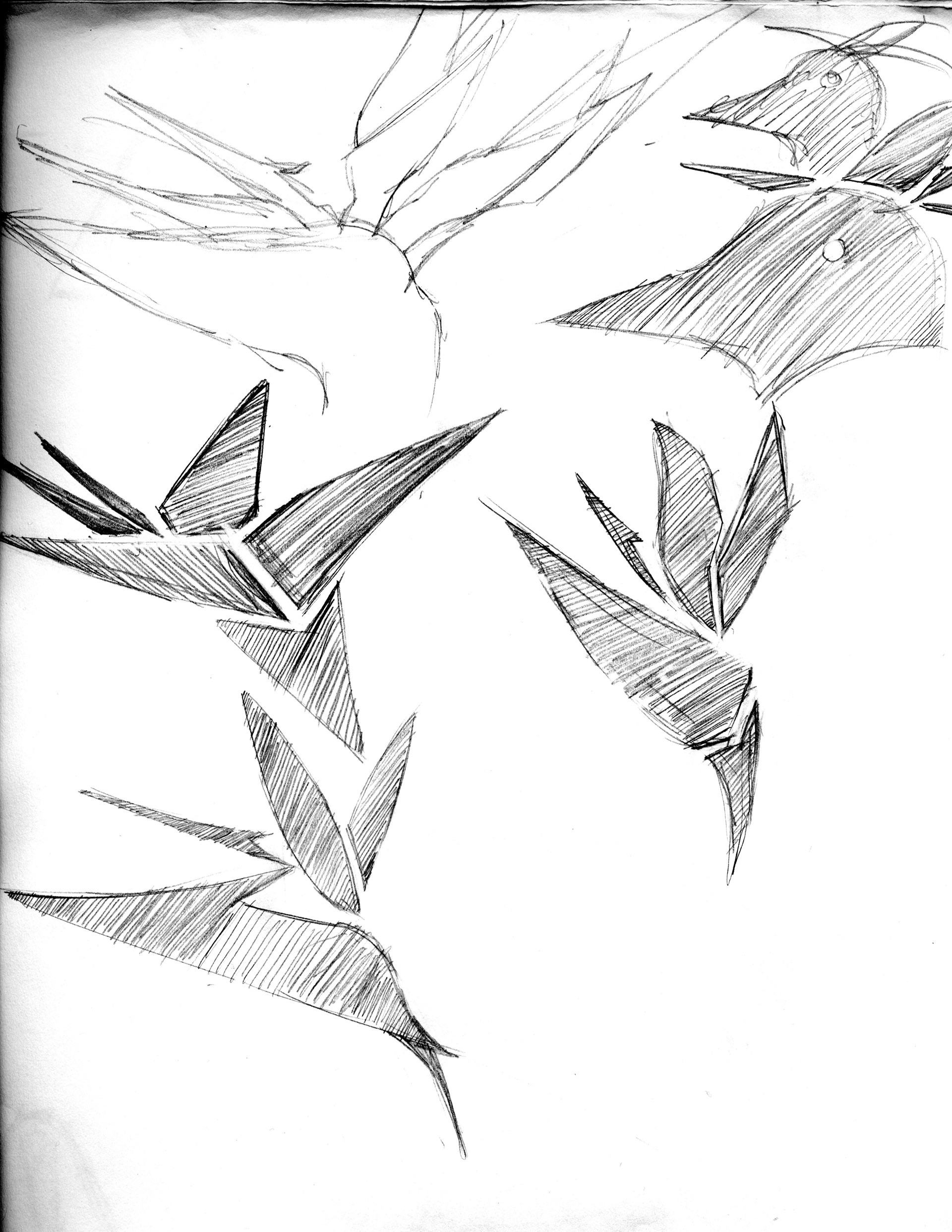
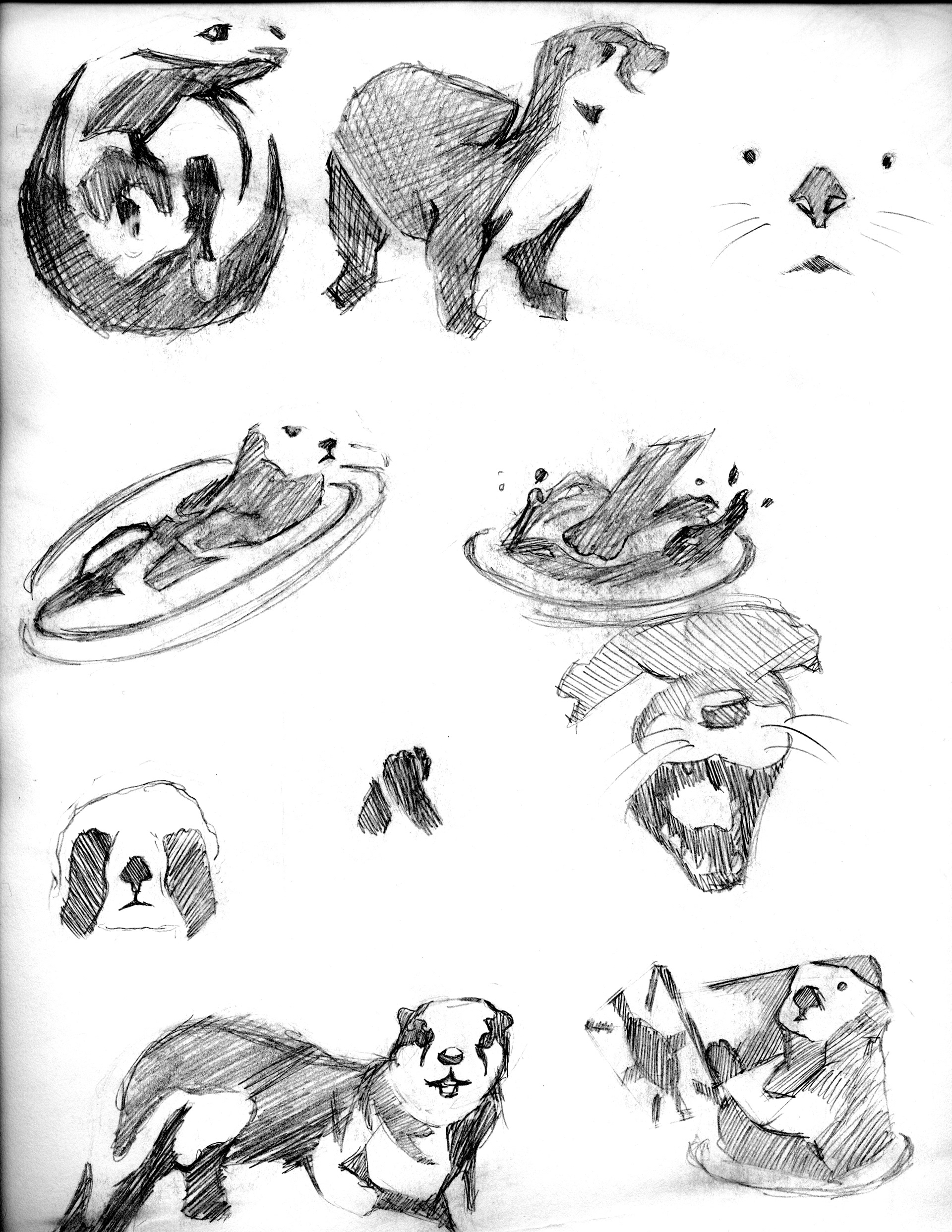
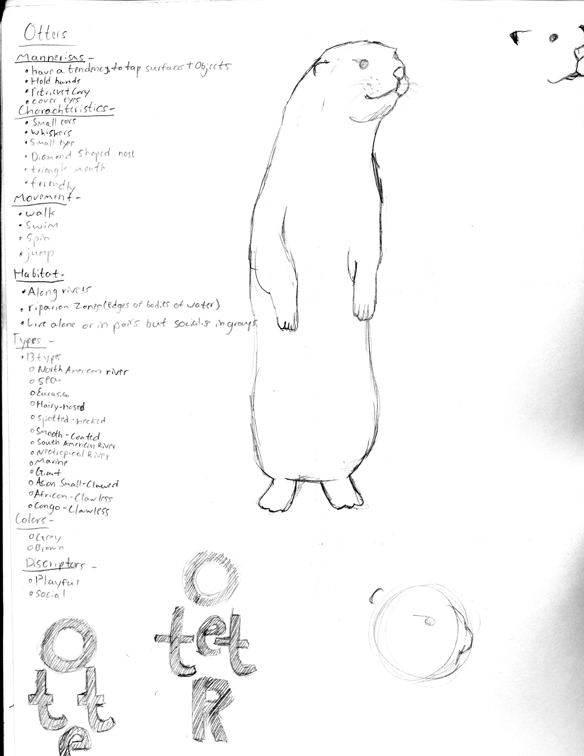
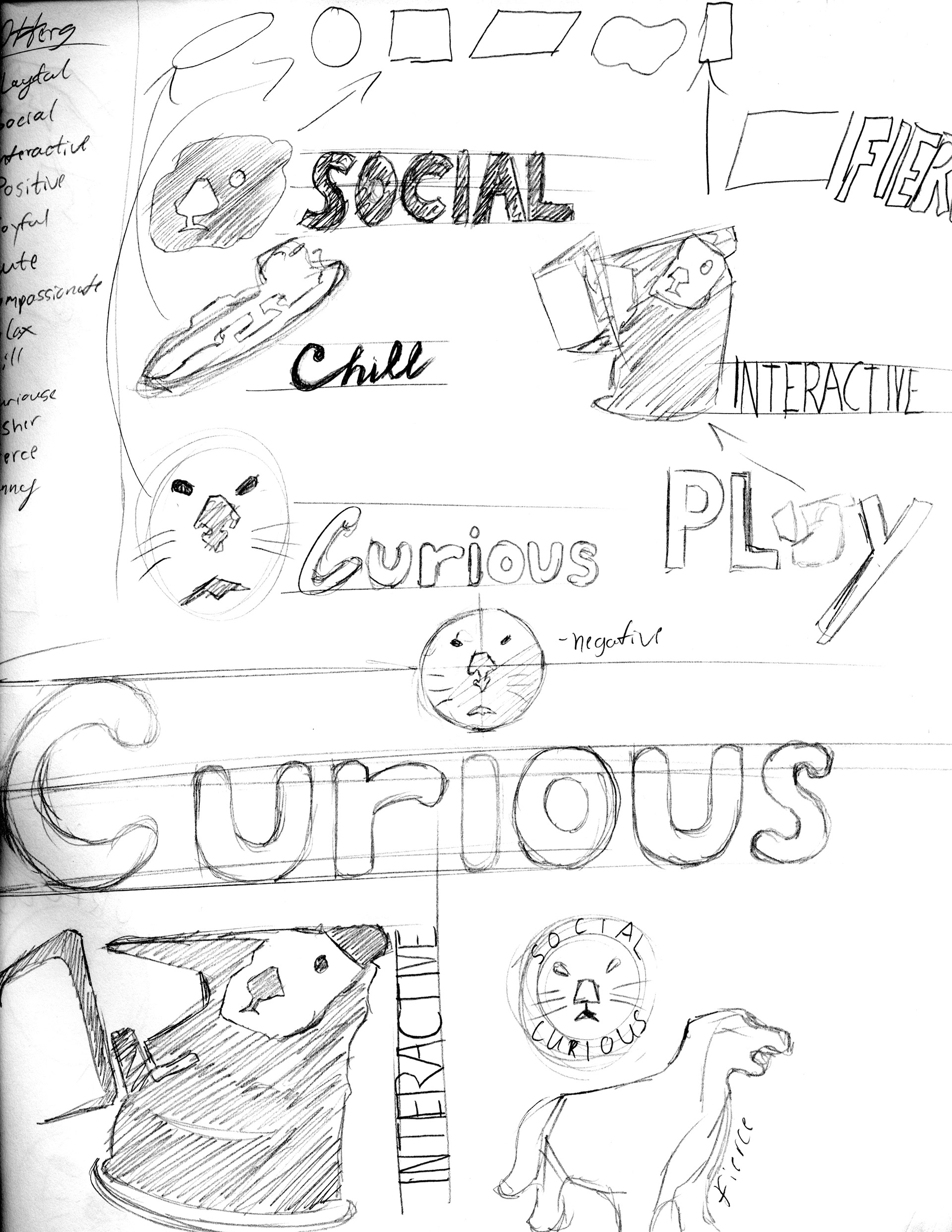
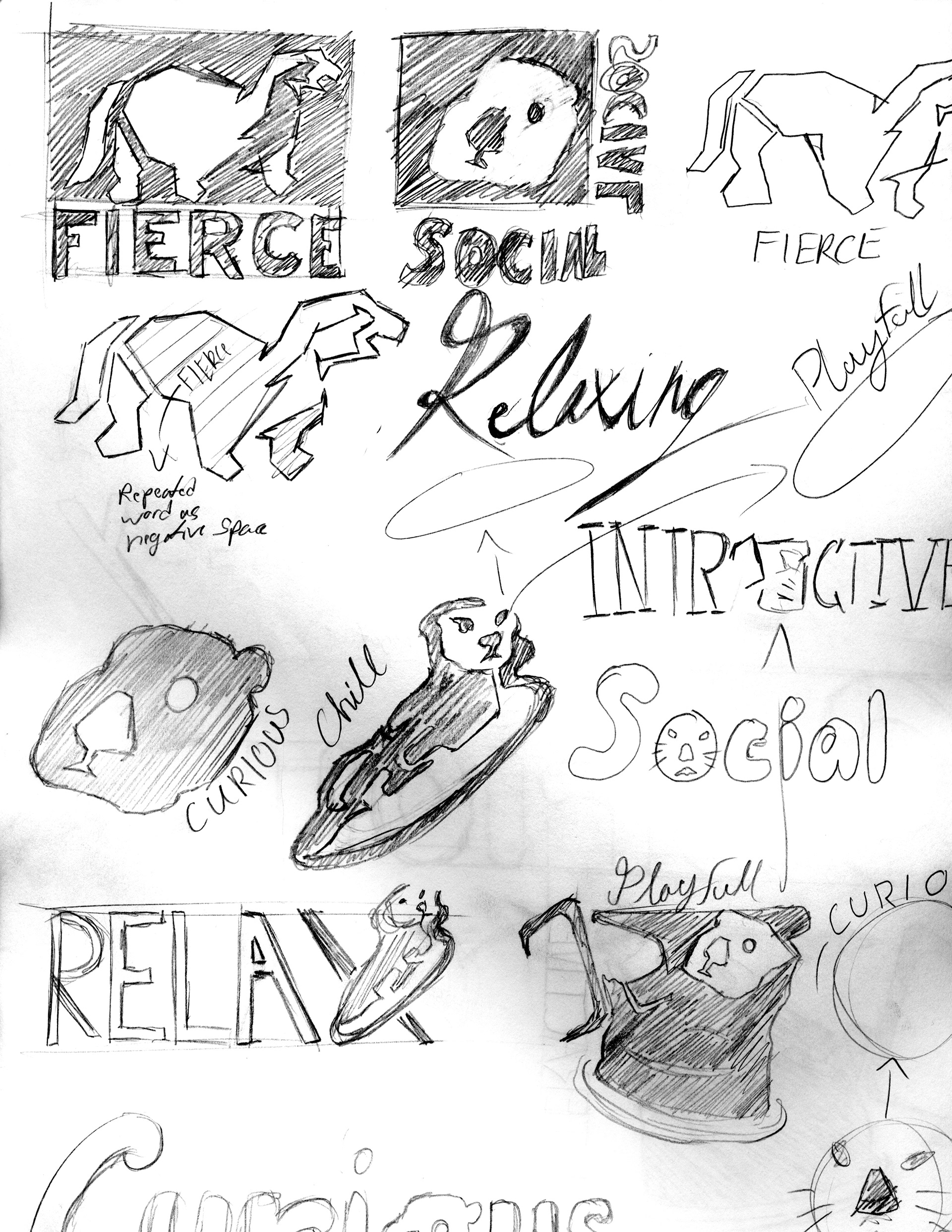
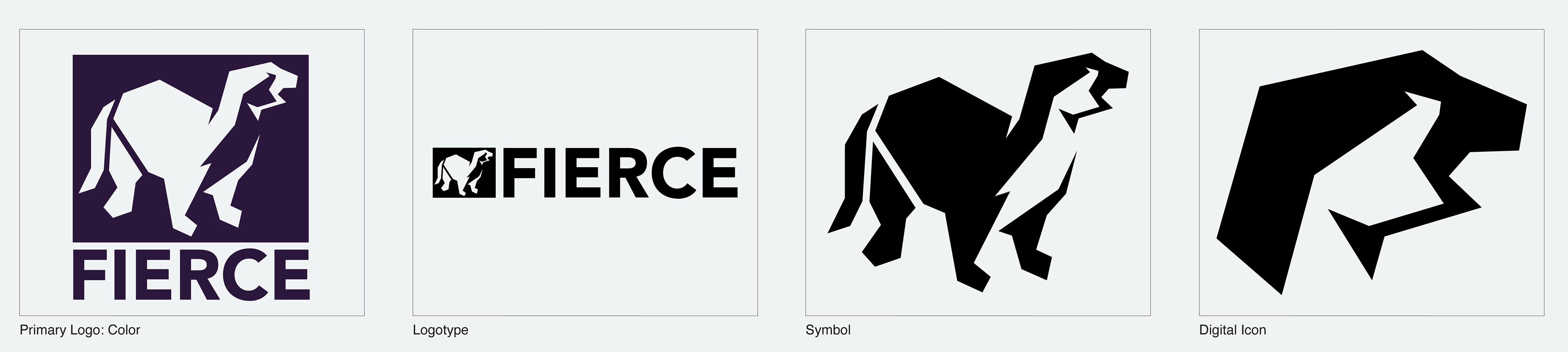
Their mark is an otter. It is an extraordinary nimble animal. It floats with ease and viciously hunts fish, The angular illustration contrasts their usual depiction of fluffy, social creatures and highlights their stronger characteristics.
The bold and angular typeface of Avenir is used for the logotype. It is in a “black“ weight to match the heaviness of the container that is part of the mark. The straight lines create a secondary box shape around the entire mark.
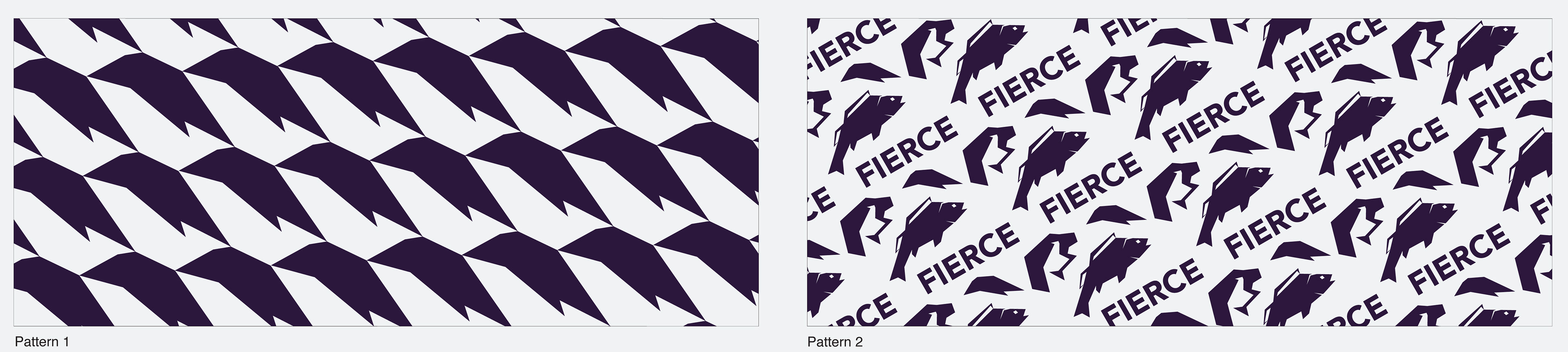
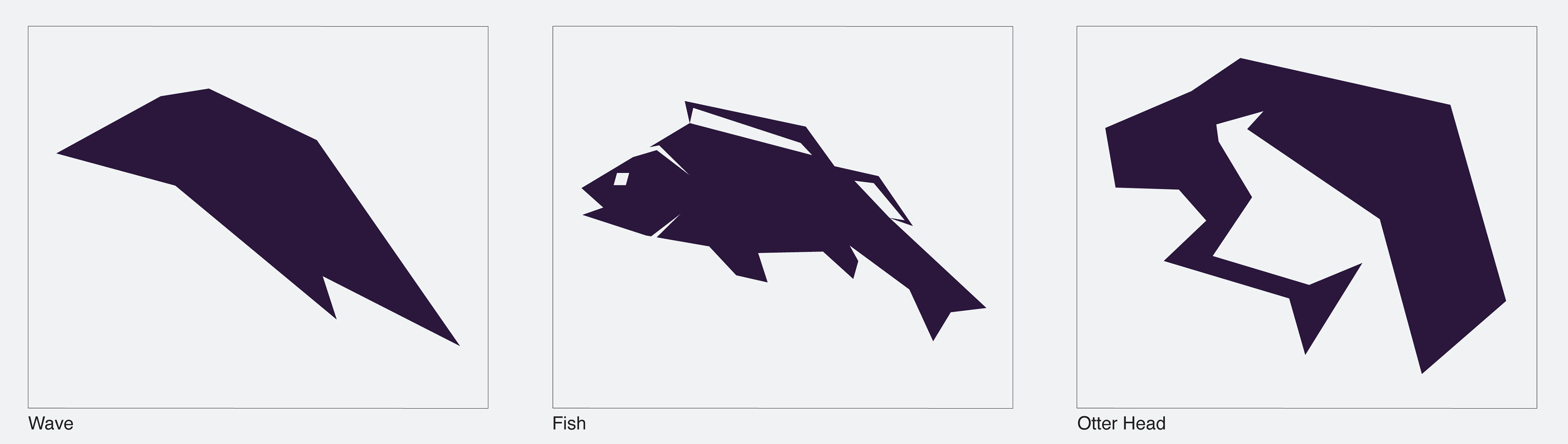
Pattern 1 comes from the “wave” graphic. This shape is taken from the negative space on the chest of the main graphic. This pattern shows the sea that otters live in while being connected to the main logo.
The “Fish” graphic is a secondary graphic as the main food source of otters. In addition, the second pattern contains the logotype and the head of the main graphic.
The “Fish” graphic is a secondary graphic as the main food source of otters. In addition, the second pattern contains the logotype and the head of the main graphic.